Homeroom
Highlights
Overview
Homeroom is a software tool that provides a unique combination of tools and support for PTOs to manage after-school enrichment programs. I led our design vision, encompassing visual and UI/UX design. I worked closely with our diverse and talented team, including engineering, sales, marketing, onboarding, and customer support experts. On the visual design front, I expanded and maintained our brand identity, visual story, and mission. On the UI/UX side, I created a simple, beautiful, and intuitive experience for our users to effectively support their needs.

Team
Team responsibilities
-
Product design: In-app B2B tool for organizers and providers
-
Product design: E-commerce experience for parents
-
Graphic design for marketing and sales initiatives
-
Marketing SEO landing page designs
-
Designs for internal initiatives, including storytelling and pitch-deck creation for fundraising
Brand/Visual
Homeroom's mission is to empower schools to be the center of the modern village. We believe that a village thrives when its children thrive, connecting us all to a brighter future. The visual inspiration behind our brand identity comes from school murals. All illustrations were created by hand on an iPad.

Primary illustration
Colors
Green
#003B3B
Blue
#366F81
Mauve
#864F58
Teal
#BFE5DD
Pink
#BF6E7C
Light green
#DFE9A0
Light pink
#EFD0D6
Salmon
#FF8D74
Green black
#032926
Symbols
Homeroom's mission is to empower schools to be the center of the modern village. We believe that a village thrives when its children thrive, connecting us all to a brighter future. The visual inspiration behind our brand identity comes from school murals.


Trust
Community and unity
Creativity


Growth
Safety
Illustrations
Homeroom's mission is to empower schools to be the center of the modern village. We believe that a village thrives when its children thrive, connecting us all to a brighter future. The visual inspiration behind our brand identity comes from school murals.

Inclusion
Every child deserves an enriching education experience.
Safety
We are our best selves when we are safe, confident and worth of trust from others.
Creativity
Creativity, exploration, and discovery make education and life more fulfilling


Connection
We are better together, be it children, neighbors, teachers, or the community at large.
Child-centered
A village thrives when its children thrive, connecting us all to a brighter future
Flexibility
Our ability to adapt to the changing needs of our villages builds resilience in us all

About us page
An immersive illustration for the hero image on our About us page

Career opportunities section
An immersive illustration for the hero image on our About us page
Design system
I established our initial product design system, starting with a simple framework and taking inspiration from larger companies' design systems. As our product matured, I began to align our design system with our product's unique identity, collaborating closely with our engineers to develop and maintain our component library.


Product
Our team worked on updating and cleaning up the product both on the UI and code end. The product was what we called, a "Frankenstein product" because of inconsistencies in UI components, user behavior and flows, and a messy codebase. The goal of this project was to prep our product for the Fall when schools are busy setting up their seasons and classes. Because this was a massive project, we decided to tackle the Organizer experience first.

Hi-fidelity Figma screens
Timeline
~ 4 months (Design completion)
Goal
Make product-wide changes to make the site more intuitive for our Organizers. Clean up back-end and front-end code and use new UI components.
Role
Design lead
Scope
-
Revisit user research and conduct new interviews to validate current user pain points
-
Re-prioritize feature request list by most urgent to least urgent
-
Re-organize tabs
-
Update UI with design system components
-
Clean up code to improve performance


In-app experience
E-Commerce experience
Understanding our users
Organizers (Primary users)
Usually a PTO/PTA member who is in charge of organizing after-school enrichment programs for their school.
Providers
Small businesses or individuals who teach the classes. They travel to the school to teach their classes.
Parents
Parents purchase after-school classes on Homeroom
How our product offers value
Organizers set up their season, add activities and send the details over to their Providers on their Homeroom accounts. The Providers check their schedules, confirm dates/times and send the activity request back to the Organizers to finalize the details. Once the classes are finalized, the classes appear on the School Registration page where parents can purchase classes on Homeroom. Homeroom provides customer support along with several payment tools and options.
User feedback and requests
Through customer help requests on Helpscout, direct interviews and general user feedback about our product, we concluded several pain points and feature requests.

User research documentation in Notion
Focus area 1: Too tedious
The original design made adding and editing tedious: too many clicks and going back and forth between modals and pages.
Focus area 2: Too restricting
In cases where there are dual-role users (both an organizer and provider), users would have to switch back and forth between accounts to complete certain tasks.
Focus area 3: Unorganized
Users had a difficult time finding certain features.
Auditing and early concepts
I spent time white-boarding in Figma, reorganizing and site-mapping to understand the current state of our platform. I worked with the team and made wireframes and mock-ups, showing them to users and adjusting the product according to their feedback.

IA

User groups

User flows
Focus area 1: Too tedious
The previous UI made adding and editing tedious. It required too many clicks and going back and forth between modals and pages.

Step 1: User clicks the "Add a course" button

Step 3: Classes are added to table

Step 2: User enters course details in a modal and sends the request over to the provider

Step 4: Repeat 10+ times. Lots of typing and clicking! (GIF from GIPHY)
Focus area 1: Early concepts
Planner experience
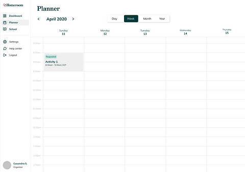
Calendar view

In-app split screen view
Pros
-
Great for viewing activities
-
Can replace the schedule tab
-
Fun layout, similar to a traditional planner
-
Lots of opportunities for interactive elements
Cons
-
A major change in experience
-
Not the best for planning
-
Not much hierarchy and can be overwhelming for new users
-
Would take a lot of time and resources
-
Is this translatable to mobile?
Focus area 1: Updated design
Observation:
Many of our organizers were already using Google sheets/spreadsheets to manage their activities. We didn't want our organizers to have to go through a major learning curve with the re-design so we wanted to add a more refined version of the tools that our organizers were already using.
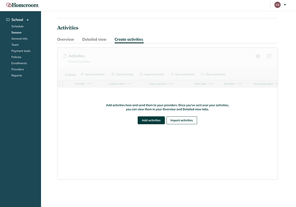
Creating activities
Many of our organizers were already using Google sheets/spreadsheets to manage their activities. We didn't want our organizers to have to go through a major learning curve with the re-design so we wanted to add a more refined version of the tools that our organizers were already using.


Organizing
Users can now sort, filter, and search for activities as well as lock, resize and reorder columns. This provides the user with full control of how they view their activities.
Sort/filter popover per column
Finalizing
Users can select multiple activities at once and perform tasks such as: sending the activity to the provider, cancelling and deleting activities, approving or denying activities and more.

Bulk select/action
Focus area 2: Too restricting
In cases where there are dual-role users (both an organizer and provider), users would have to switch back and forth between accounts to complete certain tasks


Step 1: User selects role/account type
Step 2: User enters information
Focus area 2: Updated design
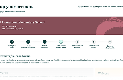
In the updated UI, we do not require users to select a certain role. Users have the flexibility to choose what permissions/tasks they prefer and sign up under one account.

Step 1: User enters information and creates an account

Step 2: User is taken to onboarding process. The user can select which situation best applies to them.


Step 3: User enters school and continues with onboarding flow. (Not all steps shown)

Select user group/type

Set up donations
Onboarding wizard UI

Add waiver/release forms

Visual call-out cards
Focus area 3: Unorganized
Users had a difficult time finding certain features. We had two different navigation menus on the left. Users would have to navigate to their Settings in order to adjust school information.

Organizer tabs

Account type view

Provider tabs
Focus area 3: Updated designs
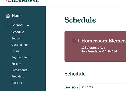

Use one main navigation bar to centralize the user's experience.
Responsiveness/Mobile
We didn't have an official app but knew that a lot of our users worked on their mobile phones. When redesigning the experience, I wanted to ensure that the updated UI translates well to smaller screens.

Course creation on mobile

Season creation on mobile

Settings on mobile

Other initiatives
Marketing
I worked closely with our Director of Marketing and the sales team to refine our copy and optimize our landing pages and SEO pages. By creating custom designs for landing pages and ads, I worked with the team on conducting experiments to enhance engagement and conversion rates.
This process involved refining messaging, content and visual elements to align with marketing goals, ultimately driving effective lead generation and customer acquisition strategies.
Fundraising
I worked closely with our C-suite to refine our company mission and story for investor presentations. This was right after the peak of COVID-19, which deeply affected our industry and crafting a compelling narrative was essential to highlight the value of our work and resilience in challenging times.
I created multiple pitch decks used in successive rounds of fundraising to effectively communicate our strategic vision and attract investor interest.

Test landing page
Reflection
-
Imposter syndrome can be brutal, especially as the sole designer at a company. My team accepted me with so much grace and patience even though I was coming in as a more junior designer. They always trusted me and treated me as an equal, which helped me excel and grow.
-
I learned what it's like to be a generalist.
-
I learned how to deliver with less and think strategically about time/resources.
-
I learned how to pivot quickly, especially in a volatile market.
-
I learned so much from my teammates, who were so talented, driven, focused and inspiring.
-
It's okay to mess up and not know things!